090: What James Clear's Website Taught Me About Presenting Your One Thing
With the start of the new year, you may be thinking of giving your website a fresh new look. But before you scroll through new templates or change up the font or the color, I suggest you look at your website and ask yourself this question:
Is my website clearly presenting my no. 1 goal to my visitors within seconds of them arriving on the site? This single question will prove to be more effective in using your website to help realize the goals you have for your business.
Do this one thing before redesigning your website:
Figure out the No. 1 goal for your website & display it prominently on your site
Now your website can do a number of things for you. From positioning you as an expert in your field, to growing your email list to demonstrating case studies/your portfolio of work, getting new clients and selling your products. While your website can do all of these things, it needs to have one primary goal which you as the website/business owner need to be clear about. And this primary goal may change from season to season and accordingly your website needs to adapt to it - more on that in the example below.
The reason for this is that once you know the No. 1 goal of your website, all other decisions will come easily - whether it is the font and color choice, to what pages go in the footer vs top navigation, to what third party integrations you will need and so and so forth.
Let me give you an example: jamesclear.com. After reading a recommendation on the blog of my colleague, Sequoia Mulgrave I went ahead purchased the book as it is now on my reading list for 2021.
A beautiful minimalist website example that shows you how to display your primary goal prominently on your site.
Click the image below to watch video:
Let’s say you are an author who has just published a new book and want to sell more copies to the people who land on your website. You will want the new book to be front and center on your homepage, prominently displayed on your top navigation and on your about page for example. Readers of your site need to know about your book within seconds of landing on your page. An author that does this extremely well is James Clear, author of New York Times bestseller, Atomic Habits. Have a look at his site:
i. Home Page
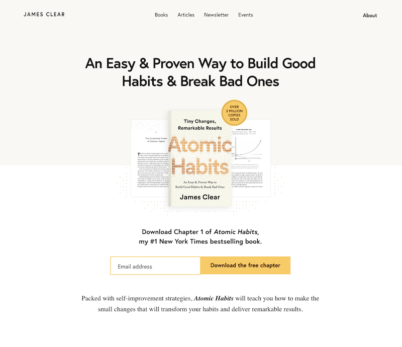
On the Home page of JamesClear.com, the first thing you’ll notice right away is that James Clear is the author of the book Atomic Habits. The image of the book is prominent, right in the center. The position is inescapable.
Also hard to miss is the opt-in form which from a marketing-perspective seems to be the no. 1 function that I notice on all pages. From a value-perspective it’s very obvious to me that giving valuable content to the readers is the number one goal of the site.
Also notice the ample use of white space or negative space. The screen is not jam-packed with content, one of the hallmarks of minimalist design. There is lots of margin, as one would say in book design and a healthy headroom, as they say in filmmaking.
Plus notice the short sentences that take up no more than 2 lines each.
ii. Books Page
Now let’s look at the Books page. Not only is the book on the homepage, it also is the first link in the top navigation. When you click Books and land on the Books page, you recognize the Atomic Habits book and then you learn that there’s another one - The Clear Habits Journal. And both of these books have buttons with calls to action where the visitor is invited to go deeper and learn more.
And that is all on this page - more is not really needed.
The Books page is beautifully laid out with the Atomic Habits and The Clear Habit Journal presented with a CTA (Call to Action button) to learn more.
iii. About Page
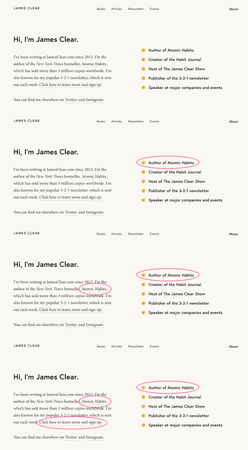
Now let’s go on to the About page. I really like the content here above the fold. Notice that instead of diving into a long form bio, what you see is a short bio which does two things:
1. it lets you know that James Clear is the author of Atomic Habits and
2. it invites you to the newsletter signup
Then on the right you see a quick snapshot of some of the things he wants you to know about him. A new piece of info here I see is that he is the host of The James Clear Show - so I am intrigued and want to know more.
And then you learn more about him throughout the page and at the bottom is again the opt-in form.
About page also shows how the main goal of the site to position authorship of Atomic Habits is visible along with the invitation to sign up to the newsletter.
The opt-in form is on the bottom of the About page and displayed in a way that the visitor will not miss it.
iv. The Footer
One final thing I want to point out is about the footer. It’s very succinct and neatly presented. Plus, notice that we only see two social media links which I take as encouragement to pick one or two social media platforms than trying to be on multiple ones.
The footer is crisp and to the point.
If you looked at the other pages like Articles and Events, you will see a similar sense of coherence and simplicity which gives a clean look and has a calming effect. There are tons of good design decisions on this site and I absolutely love it!
So I hope this website example shows you visually how you can 1. get clear about your number one goal for your website. 2. prominently display it on your website.
I am so inspired by this website that I will be incorporating the design insights into my very own website refresh which I am embarking on this year. Stay tuned for that in the following months!
Now, it’s your turn. Have you run into websites that are exemplary in your view? Share them in the comments and let me know what you think they do best and what can other website owners learn from it.
To your success,
Sophia


